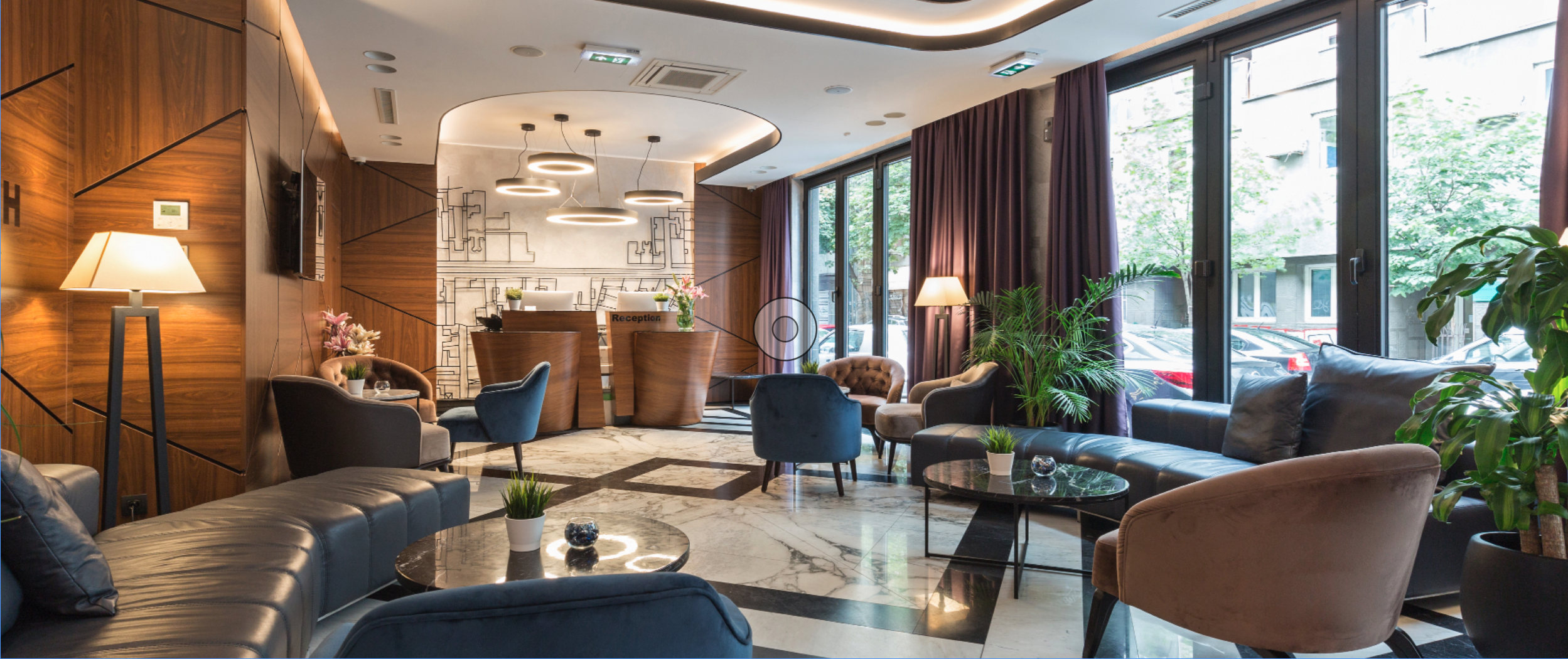
Office design plays an important role in the development of many organizations. For mental health professionals like psychiatrists, though, how their office looks and feels can directly influence their own productivity as well as the experience of their patients. As such, psychologists, psychiatrists, and therapists need to prioritize their office design and craft spaces where their patients feel comfortable and relaxed. Given all that, today we’ll focus on an important aspect of psychiatrist office design –– the color palette. Here’s how to use color effectively in your office:
Using Complementary Colors Effectively
Color can be an effective tool in the hands of the right designer. Indeed, using complementary colors or certain shades can significantly alter how a room looks and feels. Complementary colors are pairs of colors that create high contrast when placed next to each other. If you’ve taken an art class before, you might remember that complementary colors are directly across from each other on the color wheel. Examples include red and green, yellow and purple, and orange and blue. Complementary colors are a powerful tool for any designer because they can add boldness, visual interest, and contrast to a room. For a psychiatrist’s office, it is likely best to limit your color palette and choose only one pair of complementary colors to add pops of contrast around your office.
Choosing less saturated (bright) colors such as maroon instead of red and sage instead of green can help add contrast while also maintaining a tranquil and calming atmosphere. When it comes to medical office design, it’s best to utilize soft, natural, and warm colors. As such, many mental health professionals use colors like brown, maroon, black, forest green, and navy blue in their office.
Consider Color Theory
Although complementary colors can add vibrance and interest to your office, there is another consideration you should keep in mind before choosing your final color palette: color theory. Color theory explains how people perceive color and color meanings. For example, blue is associated with trust, calmness, and stability, while red is associated with love, passion, and anger. Understanding the visual implications behind the color you choose is important, because in a medical office you want patients to feel at-ease and focused. Some of the most calming colors include blue and green, while colors like red and orange can cause nervousness or unease.
Other Ways to Create Color Harmony
In addition to complementary colors and color theory, there are many other ways to select the color scheme for an office or waiting room. Another option is choosing analogous colors, which are colors that are next to each other on the color wheel. For example, light blue, green, and light green are analogous colors. These groupings are often harmonious and pleasing to look at, making them great choices for a therapist’s office. Analogous color schemes are often found in nature, so they are typically associated with comfort, serenity, and tranquility. Alternatively, choosing a monochrome look with only one primary color and different shades, tones, or tints of it can also create a calming atmosphere. However, monochrome offices can become bland or sterile looking, so throwing in a colorful pillow or wall painting can help add interest to the room.
Contact Us
At Key Interiors, we have a long history of partnering with medical professionals to create office designs that suit their preferences and address their needs. We understand the unique challenges and opportunities associated with this field, and we can help you build the office of your dreams. Contact us here to learn more or to get started with us today.
