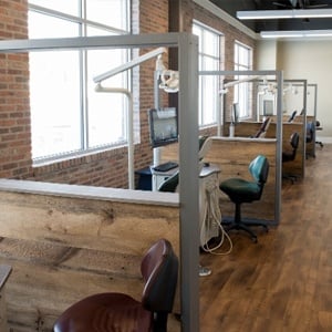
 At Key Interiors, we have partnered with many dentists either to refresh their office, or lead the way on a major overhaul.
Naturally, every office is unique, and many design-related decisions must be made in consultation with each dentist and her or his team members. However, generally speaking, there are fundamental principles that govern a smart, strategic approach to dental office design.
When these principles are not followed – either because they are not recognized by the design team, or not clearly and fully understood – the result, invariably, are design flaws. Below, we highlight the 5 most common:
-
Not Anticipating Future Needs
Often, dental office design choices and decisions are made based on current needs. Of course, this is sensible and necessary. However, it is also vital to anticipate future needs as well.
For example, a dental office located in an area that is becoming increasingly populated by families with small children should factor this upcoming demographic shift into their design considerations.
-
Workflows
Another major – and common – dental office design flaw is poorly configured workflows. This typically leads to “traffic jams” in the office, as team members are constantly in each others’ way. It can also lead to inefficiencies with respect to supplies.
For example, dental offices that have multiple sanitization stations often find themselves short of essential supplies, while dental offices that consolidate their stations in one area can easily and constantly keep an eye on supply levels.
-
Overlooking Regulations
After completing an office design or re-design project, many dentists are stunned to discover that their layout is not compliant with prevailing regulations.
For example, the American Dental Association mandates that every door in a dental office must have 18 inches of clearance on one side, and 12 inches of clearance on the other. And OHSA regulations have strict rules around labeling and warnings, which must be clearly visible and not obstructed by cabinets, furniture, shelving, etc.
-
Underestimating Aesthetics
While optimizing workflows is (as noted above) a key consideration, many dental offices learn too far towards functionality, and not enough towards esthetics.
This does not mean that a dental office should look like an art gallery or spa; unless of course that is part of the overall branding strategy. However, it is important to appreciate that patients want a soothing, relaxing and professional environment, and esthetics play an important role in making that happen.
-
Not Being Employee-Friendly
Last but not least, many dental offices succeed in incorporating all of the above, but neglect to make their space employee-friendly.
As such, the furniture is uncomfortable, the lighting is either too bright of dim, the technological infrastructure may be lacking (e.g. not enough outlets, limited Internet connection, etc.), and so on.
Obviously, not every employee request or preference can be implemented. For example, in smaller offices, having a staff meeting room simply may not be viable. However, there are creative ways to maximize space utilization and address some, if not all, employee requirements and needs.
The Bottom Line
If you are looking to design or re-design your dental office, contact Key Interiors today and schedule your free consultation. Our team will work with you to create an environment that is efficient, stylish, patient-focused, employee-friendly, compliant with all regulations, and truly brings your unique practice to life!
