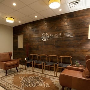
 For many doctors and dentists, their patient waiting room is – as the name suggests – a comfortable, functional space where patients and their family members wait anywhere from a few minutes, to possibly over an hour.
However, the aforementioned patients and family members view things differently. That is, they do not just perceive waiting rooms in terms of what they are on a functional level (i.e. spaces within which to wait). Rather, they perceive waiting rooms as an experience that is either positive or negative.
Naturally, doctors, dentists, and their respective staff want that experience to be positive; especially since some individuals are anxious at the mere thought of “going to do the doctor” or “going to the dentist” – even if it is for a routine checkup or minor, quick treatment or procedure.
Furthermore, competition for patient loyalty is vital for practice stability and growth, and whether patients feel good or bad about their experience is a major factor in whether they will remain patients, and refer others (e.g. colleagues, neighbors, etc.).
In light of the above, here are 3 best practices for medical and dental office waiting room designs:
1. Focus on Comfort
While the “back end” of a medical or dental office can be a model of space utilization where functionality and form govern many design elements, the waiting room is an altogether different story. The number one consideration should be patient comfort.
As such, the chairs should be comfortable, the lighting should be soothing yet bright enough for patients to read or work, and there should be ample table space.
And speaking of work: power outlets and wi-fi are highly appreciated by patients, as well as by accompanying family members. Many medical and dental offices also have flat screen TVs, and may have a special section for kids to have fun (complete with video game consoles!).
2. Remember that it’s a Waiting ROOM
Traditionally, the operative word in “waiting room” has been waiting. As such, it was not uncommon (and is still not uncommon now) to see an abundance of chairs, and very little else.
However, the most patient-friendly medical and dental office waiting room designs are those that remember that it’s a waiting ROOM, and as such it should be roomy. Patients should easily be able to get up and move around without bumping into other people, having to step over bags and purses, and so on.
3. Enable staff-patient engagement.
Conventional (“old school”) medical and dental office design separated the waiting room from the reception area. In fact, it is not uncommon to come across some offices where the reception area and waiting room are not even within sight of each other.
However, today’s more modern and dynamic practices bring patients closer to the reception area, so that staff can be within easy reach to answer questions and, especially, to make sure that patients are comfortable.
What’s more, many practices are wisely recognizing that they need to educate patients more on various options (such as cosmetic dentistry), and bringing reception areas closer to waiting rooms can help facilitate this process.
The Bottom Line
Ultimately, each practice is unique, and this fundamental truth must express itself in the design as well – including but not limited to waiting rooms. However, with this being said, it is wise and, indeed, more patient-friendly and profitable, to incorporate best practices like those noted above.
Learn More
To learn more, contact the experts at Key Interiors today. We have in-depth experience working with doctors, dentists and other healthcare professionals to refresh or re-invent their offices.
